Accessible Minimalism
Redesigning Nothing.tech's homepage, product, and collections pages to meet WCAG 2.2, without losing what makes the brand distinctive.
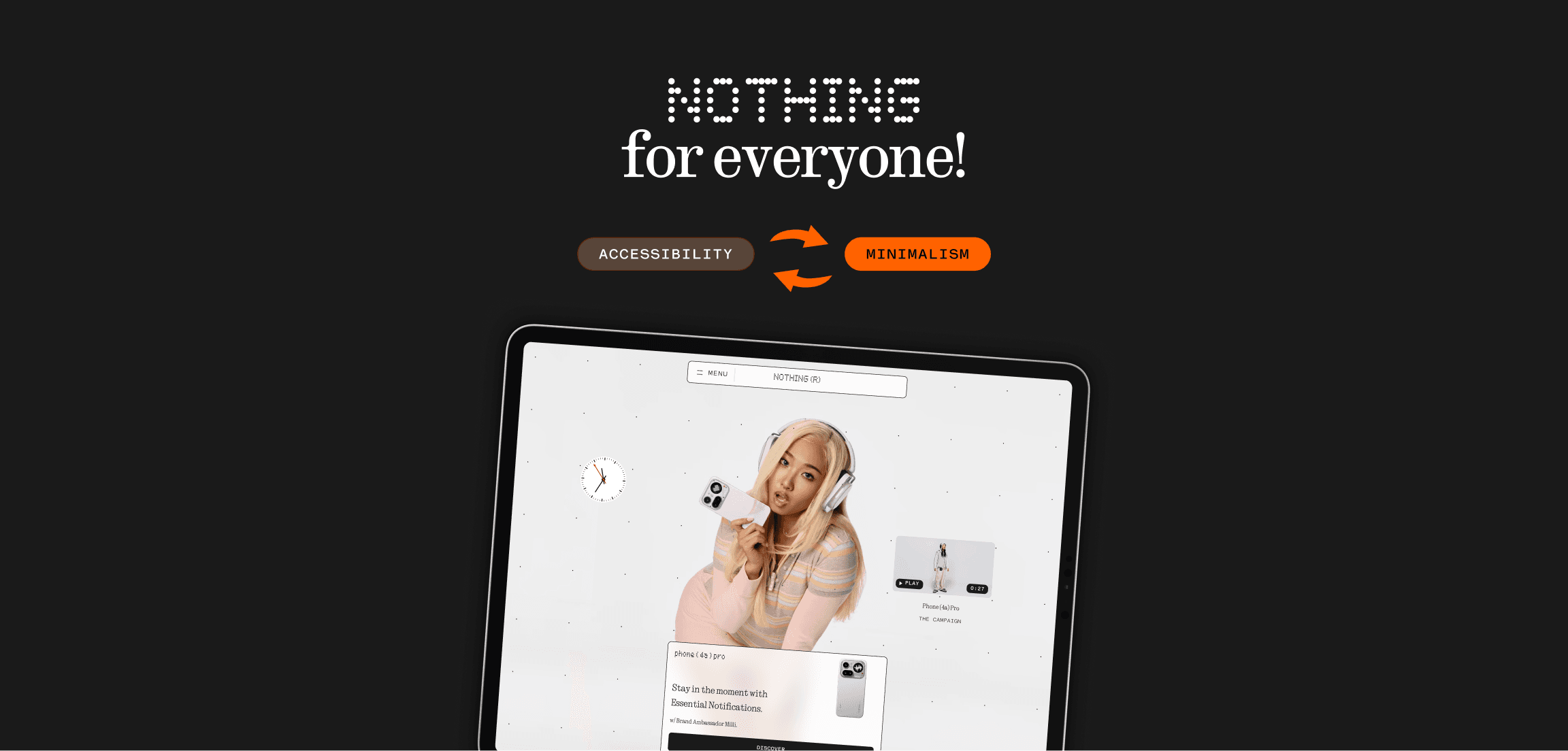
A systematic audit and redesign across three pages: homepage, product, and collections, resolving four WCAG 2.2 violations using only Nothing's own design language. No new colours, typefaces, or structural changes.
year
2026
timeframe
3 weeks
role
Sole designer
skills
WCAG accessibility auditing, Interaction design, Visual design systems, Heuristic evaluation, UI redesign


Same interface, same identity, accessible where it wasn't. Drag to compare.
Four Violations, Three Pages
Homepage, product, and collections pages were evaluated manually against four WCAG 2.2 criteria chosen for their direct link to Nothing's visual decisions.
Non-Text Contrast
Interactive containers had no visible boundary
Labels or Instructions
Nav icon carried no text label
Focus Appearance
Focus states removed sitewide
Pause, Stop, Hide
Auto-play video had no control


01 DECISION
Boundary strokes make containers visible
Static containers had no visible edge against the background. Fix: a 1px #1a1a1a stroke, already part of Nothing's UI, applied wherever contrast fell below 3:1.
Before

After

02 DECISION
Solid backgrounds fix video contrast and control
Frosted overlays had unpredictable contrast against changing video. A solid #1a1a1a background guarantees contrast and turns the decorative PLAY label into a working PLAY/PAUSE toggle.
Before

After

03 DECISION
Solid cards guarantee contrast on collections
Product cards relied on the image behind them for contrast, unreliable and unmeasurable. A solid white card background fixes it regardless of the product photo inside.
Before

After

04 DECISION
A visible label makes navigation self-explanatory
An icon-only nav control relied entirely on visual convention. Adding "MENU" in the existing nav typeface makes it self-explanatory, no new visual element introduced.
Before

After

05 DECISION
A brand-black focus ring restores keyboard visibility
Focus states were suppressed sitewide, leaving keyboard users with no sense of position. A 2px solid #1a1a1a ring, invisible at rest, unambiguous in use, restores it using Nothing's own colour.
Before

After

Impact: Compliance Without Compromise
All four WCAG 2.2 criteria pass across all three pages. Zero new colours, typefaces, or structural changes introduced, every fix uses Nothing's own design language.
WCAG criteria resolved
Pages redesigned
New colours introduced


